Components
Product Card
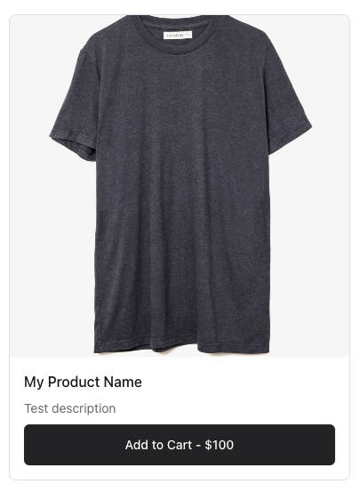
The Product Card component is a simple card that displays a product's image, name, and all of it's prices. It is used to display products in a grid or list format, like in theProduct Listing component.
This component is automatically included on the provided Cart page, but you can also include it on any page. It
includes a link to the /cart page by default.
This will automatically display the product's prices with the Cart Button.
Example
You can create a Product Card by passing it a $product prop. This can either by a
Product model or the Product's $product->product_id.
1<x-conduit::product-card :product="\Mergeloop\Conduit\Models\Product::find(1)"/>2 3{{-- OR --}}4 5<x-conduit::product-card :product="$product"/>6 7{{-- OR --}}8 9<x-conduit::product-card :product="$product->product_id"/>
Please note that you cannot pass the $product->id property. You must pass the
$product->product_id property as that is the actual reference to the Price's Stripe or Paddle ID.
Display Example
Overriding the Display
Click here to learn how to override the display of the Product Card component.