Components
Product Listings
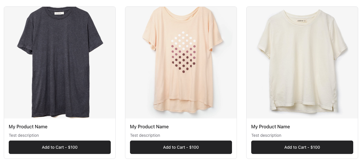
The Products component is a simple way to display a grid list of Products. It is a wrapper around the Product Card component. It will display a 3 column grid of Products on desktop, 2 on tablet, and 1 on mobile.
This will automatically display all one-time purchase Products, i.e. no Subscriptions or recurring.
Example
1<x-conduit::products />
Display Example
Overriding the Display
Click here to learn how to override the display of the Products component.